When a couple chooses a grand cathedral for their wedding ceremony, there's often an expectation that everything will be formal, traditional, and perhaps a little serious. But what happens when the couple themselves are anything but? That's exactly the delightful challenge I faced with this recent order of service project.
The Brief: Classic Meets Fun-Loving
The couple wanted stationery that matched the elegant and historic Ripon Cathedral at which they were to be married. But they also wanted guests to know, from the moment they picked up their order of service, that this was going to be a joyful celebration.
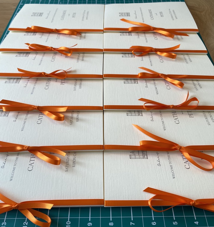
Their solution? A vibrant splash of orange.
Choosing the Perfect Paper
For a cathedral setting, the paper choice is crucial. I selected a beautiful textured cream card with a subtle linen finish — it feels luxurious to hold and photographs beautifully in those atmospheric church lighting conditions. The weight needed to be substantial enough to feel special, but not so heavy that the booklets would be cumbersome for guests to hold during the ceremony.
Stationery Tip: When choosing paper for order of service booklets, always consider the lighting in your venue. Cream and ivory tones work beautifully in churches and historic buildings, while bright white can sometimes look stark.
The Typography
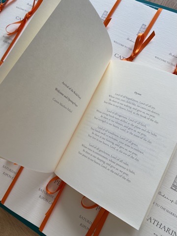
I worked with a classic serif typeface for the main text — elegant and easy to read, even in candlelit conditions. The couple's names on the cover were set in a graceful script, adding a personal, romantic touch without being overly ornate.
Inside, the order of ceremony was laid out with careful attention to hierarchy. The different sections of the service — The Address, The Marriage, The Exchange of Vows, The Giving and Receiving of Rings, The Blessing — were clearly defined, making it easy for guests to follow along.
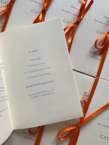
Inside pages with clear typography for easy reading during the ceremony
That Signature Orange Ribbon
And then came the element that brought it all together: hand-tied satin ribbon in the most gorgeous orange shade. Each booklet was finished with a neatly tied bow, adding a pop of colour that was visible even from across the church.
The orange wasn't random. It represented the fun and outgoing nature of the couple and by carrying it through all of the stationery from the save the dates to the ceremony pieces, it created a wonderful sense of cohesion.
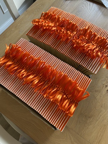
Every ribbon hand-tied with care — ready to make an impression
The Finishing Touches
To add an extra personal element, I included a small illustrated motif of the cathedral on the front cover. This subtle detail made the booklets feel truly bespoke and gave guests a lovely keepsake to remember the day.
Each booklet was carefully assembled by hand — folding, inserting the pages, and tying every single ribbon with consistent loops. It's this attention to detail that transforms stationery from functional items into meaningful parts of your wedding story.
Lessons for Your Wedding Stationery
This project reminded me of some important principles that I bring to every order of service I create:
- Respect your venue — let its character inform your choices
- Inject your personality — there's always room for a personal touch, even in formal settings
- Think about cohesion — connecting your ceremony stationery to your wider wedding palette creates a polished look
- Consider the practical — guests need to be able to read and hold your order of service comfortably
- Don't forget the keepsake factor — many guests love to take their order of service home
Planning a Cathedral or Church Wedding?
If you're getting married in a cathedral, church, or any venue with historic character, I'd love to help you create order of service booklets that honour the setting while celebrating who you are as a couple. Whether you want classic elegance, a bold colour pop, or something entirely unique, every design starts with your story.
Ready to Create Your Perfect Order of Service?
Every wedding ceremony deserves beautiful stationery. Get in touch to discuss your vision.
Start Your Enquiry